The AppAuthProvider will supply defaults for `redirectUri`, `silentRedirectUri`, `onRedirectCallback` to `AuthProvider` from the Auth-SDK.
It also sets `credentials` to true.
- v1.0.0-latest-prod
Components provided by @broadleaf/commerce-shared-react.
These are the core, shared components used by the Microfrontends. Generally, when used within a microfrontend provided by Broadleaf, they will be rendered using the ComponentRenderer to allow easy overridability by users. However, in your own container applications, you can use them directly like normal components.
These components set up the various common React contexts.
The AppAuthProvider will supply defaults for `redirectUri`, `silentRedirectUri`, `onRedirectCallback` to `AuthProvider` from the Auth-SDK. It also sets `credentials` to true.
|
Tip
|
see AppAuthProviderProps for props. |
Sets up a shared context containing configured SDK Clients for reuse. Should be wrapped in LocaleContext, PreviewContext, and TenantContext for correct function. It is also expected that all Clients will already be registered.
This context is just for microfrontend components to be able to access configured SDK Clients. It will build out the keys using the available context information to simplify this.
|
Tip
|
see ClientProviderProps for props. |
Sets up a shared context containing the locale information for the application.
|
Tip
|
see LocaleProviderProps for props. |
Sets up a shared context containing the location information for the application. The location information is an abstraction from the JavaScript Location API. This takes into account whether its being called on the server-side or client and if there’s a reverse proxy in place, which is typical.
|
Tip
|
see LocationProviderProps for props. Also see getLocationState for the default implementation. |
Sets up a shared context containing the preview-on-site information for the application.
It also renders the PREVIEW_LAYOUT component that is primarily responsible for adding the PREVIEW_HEADER component for rendering Preview-on-Site components.
|
Tip
|
see PreviewProviderProps for props. |
Sets up a shared context containing the tenant information for the application.
|
Tip
|
see TenantProviderProps for props. |
Sets up a shared configuration context for shared components.
|
Tip
|
see SharedConfigContextProviderProps for props. |
These are components that wrap other components to provide additional functionality. They do not generally render anything themselves, but they may render null if they provide an error or loading state.
Component responsible for checking whether the auth session is active.
It will try to extend the session if possible based on keepAlive, keepAliveIntervalMinutes, and if the window is in focus.
If the session is expired either due to the token’s expiration or the user’s inactivity, the component will logout the user automatically.
|
Tip
|
see AuthSessionManagerProps for props. |
These are components that are used to provide a layout for the application.
The PageLoader component is used to provide a loading state for the application.
|
Tip
|
see PageLoaderProps for props. |
Wraps the rest of the rendered components to add the PREVIEW_HEADER component that is represented as a ribbon above the rest of the normal layout with Preview-on-Site functions.
|
Tip
|
see PreviewLayoutProps for props. |
These are components that are used to provide common UI elements for the application.
A component that will render a Link if given an href attribute otherwise a Button.
It takes the same props as a Button and Link.
|
Tip
|
see ActionProps for props. |
A component that will format a number as a currency amount.
This uses react-intl’s FormattedNumber component under the hood.
|
Tip
|
see FormattedAmountProps for props. |
A component that will render FormattedAmount with 0 as a default value if the monetary amount is undefined.
|
Tip
|
see FormattedAmountOrZeroProps for props. |
A specialized component that can determine whether to render a FormattedAmount or a FormattedAmountOrZero based on the presents of a fallbackCurrency prop.
If present, it will render a FormattedAmountOrZero.
|
Tip
|
This takes the same props as FormattedAmount and FormattedAmountOrZero. |
className: The class name to apply to the icon.
Optional.
stroke: The stroke width of the icon.
Optional.
This will become the stroke-width attribute of the underlying SVG element.
title: The title of the icon.
Optional.
This will become the <title> of the underlying SVG element.
fill: The fill color of the icon.
Optional.
This will become the fill attribute of the underlying SVG element.
ArrowLeftIcon: ARROW_LEFT_ICON
BarsIcon: BARS_ICON
CallIcon: CALL_ICON
CartIcon: CART_ICON
CheckCircleIcon: CHECK_CIRCLE_ICON
ChevronDownIcon: CHEVRON_DOWN_ICON
ChevronLeftIcon: CHEVRON_LEFT_ICON
ChevronRightIcon: CHEVRON_RIGHT_ICON
ChevronUpIcon: CHEVRON_UP_ICON
CircleIcon: CIRCLE_ICON
ClipboardChecklistIcon: CLIPBOARD_CHECKLIST_ICON
Clock: CLOCK
CloseIcon: CLOSE_ICON
CopyIcon: COPY_ICON
EditIcon: EDIT_ICON
EmptyStarIcon: EMPTY_STAR_ICON
ErrorIcon: ERROR_ICON
ExternalLinkIcon: EXTERNAL_LINK_ICON
FacebookIcon: FACEBOOK_ICON
FullStarIcon: FULL_STAR_ICON
GlobeIcon: GLOBE_ICON
HeartEmptyIcon: HEART_EMPTY_ICON
HeartFullIcon: HEART_FULL_ICON
InstagramIcon: INSTAGRAM_ICON
KebabIcon: KEBAB_ICON
LinkedInIcon: LINKEDIN_ICON
LoadingIcon: LOADING_ICON
LockIcon: LOCK_ICON
LogoIcon: LOGO_ICON
Logout: LOGOUT
MailIcon: MAIL_ICON
MenuIcon: MENU_ICON
MinusIcon: MINUS_ICON
MusicIcon: MUSIC_ICON
PencilWithPaperIcon: PENCIL_WITH_PAPER_ICON
PhoneIcon: PHONE_ICON
PlusIcon: PLUS_ICON
PromoIcon: PROMO_ICON
QuestionMarkCircle: QUESTION_MARK_CIRCLE
SearchIcon: SEARCH_ICON
ShoppingBagIcon: SHOPPING_BAG_ICON
SortAscending: SORT_ASCENDING
SortDescending: SORT_DESCENDING
SparkleIcon: SPARKLE_ICON
TextBubblesIcon: TEXT_BUBBLES_ICON
TrashIcon: TRASH_ICON
TwitterIcon: TWITTER_ICON
UpDownArrowsIcon: UP_DOWN_ARROWS_ICON
UserIcon: USER_ICON
VideoIcon: VIDEO_ICON
WarningIcon: WARNING_ICON
import { ComponentRenderer } from '@broadleaf/commerce-shared-react';
import { ArrowLeftIcon } from '@broadleaf/commerce-shared-react';

const MyComponent = () => {
  return (
    <div>
      <h1>My Component</h1>
      <ArrowLeftIcon
        className="my-icon"
        stroke={2}
        title="Arrow Left Icon"
        fill="red"
      />
      <!-- Using Component Renderer if requiring additional overridability -->
      <ComponentRenderer
        name="ARROW_LEFT_ICON"
        className="my-icon"
        stroke={2}
        title="Arrow Left Icon"
        fallback={ArrowLeftIcon}
      />
    </div>
  );
};A component that will render a placeholder image. By default, it will use a square aspect-ratio.
|
Tip
|
see ImagePlaceholderProps for props. |
This is a wrapper around Formik’s Field component.
|
Tip
|
see Formik Field. |
autoComplete: boolean: The auto-complete attribute for the input.
Optional.
children: React.ReactNode: The children to render inside the input.
Optional.
className: string: The class name to apply to the input.
Optional.
inputClassName: string: The class name to apply to the input element.
Optional.
label: string: The label to display for the input.
Optional.
name: string: The name of the input.
Required.
placeholder: string: The placeholder text for the input.
Optional.
readOnly: boolean: Whether the input is read-only.
Optional.
required: boolean: Whether the input is required.
Optional.
requiredMessage: string: The message to display if the input is required.
Optional.
tip: ReactNode: The tip to display for the input.
Optional.
step: string: The step attribute for the input.
Optional.
maxLength: number: The maximum length of the input.
Optional.
minLength: number: The minimum length of the input.
Optional.
validate: (value) ⇒ string: The validation function for the input.
Optional.
Parameters:
value: string | readonly string[] | number: The value of the input.
onChange: ChangeEventHandler<HTMLInputElement>: The change event handler for the input.
Optional.
type: The type of the input.
Optional.
Values:
button
color
date
datetime-local
email
file
hidden
image
month
number
password
radio
range
reset
search
submit
tel
text
time
url
week
This component was changed to allow a drop down list of user roles to extend beyond the bottom of the modal. Without the various changes seen here, the modal would either lose its rounded border or the dropdown would be cut off.
children: React.ReactNode: The children to render inside the modal. Optional.
title: string: The title of the modal. Required.
isOpen: boolean: Whether the modal is open. Required.
setIsOpen: (state: boolean) ⇒ void: Function to set the open state of the modal. Required.
onCancel: () ⇒ void: Function to call when the modal is cancelled. Required.
isOverflowHidden: boolean: Whether to hide the overflow of the modal. Optional.
size: string: The size of the modal. Optional.
Should be a classname.
import { useState } from 'react';
import { Modal } from '@broadleaf/commerce-shared-react';
import { Button } from '@broadleaf/commerce-shared-react';
import { useFormatMessage } from '@broadleaf/commerce-shared-react';
import { messages } from './messages';
const DEFAULT_REASONS = [
{ id: '1', name: 'Reason 1' },
{ id: '2', name: 'Reason 2' },
];
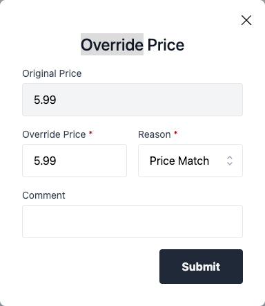
const CSREditPrice = ({ className, originalPrice, overrideReasons = DEFAULT_REASONS }) => {
const formatMessage = useFormatMessage();
const [isOpen, setIsOpen] = useState(false);
return (
<div className={className}>
<Button
className="text-sm text-link hover:text-link-hover hover:underline focus:text-link-hover focus:underline focus:outline-none"
onClick={() => setIsOpen(true)}
>
{formatMessage(messages.editPriceButton)}
</Button>
<Modal
title={formatMessage(messages.overridePriceTitle)}
isOpen={isOpen}
setIsOpen={setIsOpen}
onCancel={() => setIsOpen(false)}
>
<div className="mb-4 text-left">
<label className="mb-1 block text-sm text-gray-700">
{formatMessage(messages.originalPrice)}
</label>
<div className="flex items-center">
<input
value={originalPrice.amount}
className="h-12 w-full rounded border bg-gray-100 px-4 py-2 transition focus:outline-none disabled:bg-gray-50"
readOnly
/>
</div>
</div>
<CSREditPriceForm
isOpen={isOpen}
setIsOpen={setIsOpen}
originalPrice={originalPrice}
overrideReasons={overrideReasons}
/>
</Modal>
</div>
);
};Represents a Button stylized as a primary action.
Takes the same props as Button along with the following: Styling is applied using Tailwind CSS utility classes.
className: string: Optional class name to apply to the button.
rounded: boolean: Whether the button is rounded.
Optional.
spinning: boolean: Whether to render a spinner icon inside the button to indicate loading state.
Optional.
Represents a Button stylized as a secondary action.
Takes the same props as Button along with the following: Styling is applied using Tailwind CSS utility classes.
className: string: Optional class name to apply to the button.
rounded: boolean: Whether the button is rounded.
Optional.
spinning: boolean: Whether to render a spinner icon inside the button to indicate loading state.
Optional.
Allows specifying the title of an SVG as a prop.
This then allows us to handle different browsers' compatibility with SVG title’s by adding a unique ID to the title and adding the aria-labelledby attribute to the <svg> pointing to the title.
This takes all the props of an <svg> and automatically adds the xmlns attribute.
A component that will render a <textarea>.
Similar to InputField in that it will also use a formik Field.
id: string: The id of the textarea. Optional.
fieldName: string: The name of the textarea. Optional.
requiredMessage: string: The message to display if the textarea is required. Optional.
label: string: The label to display for the textarea. Optional.
required: boolean: Whether the textarea is required. Optional.
validate: (value) ⇒ string: The validation function for the textarea. Optional.
Parameters:
value: string | readonly string[] | number: The value of the textarea.
readOnly: boolean: Whether the textarea is read-only. Optional.
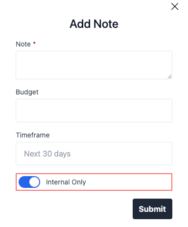
A component that will render a toggle switch.
value: boolean: The value of the toggle. Required.
setValue: Dispatch<SetStateAction<boolean>>: The function to set the value of the toggle. Required.
label: string: The label to display for the toggle. Optional.
required: boolean: Whether the toggle is required. Optional.
className: string: The class name to apply to the toggle. Optional.