Broadleaf Microservices
  • v1.0.0-latest-prod

Unified Admin Release Notes for 1.10.13

Features & Enhancements

Support Retail Delivery Fee Refunds

  • Introduced the ability to optionally request the refund of order fees (esp. Retail Delivery Fees) when requesting creating a ReturnAuthorization.

Important Updates

  • Now supports Node 22 and 24. We recommend upgrading to Node 24 as soon as possible since Node 20 reaches end of life in April 2026.

    • Upgrading Node is not required to use this update.

Introduced Badges for Tile and List Grids

Added support for badges in both Tile and List grid views within the Unified Admin interface. This enhancement allows developers to define badges that can be displayed on individual items in these grids, providing additional context or status information at a glance.

Badges are rendered through BadgeColumn and BadgeTileComponent components, which can be configured in the metadata for the respective grid views. This feature enhances the visual representation of data and can be particularly useful for highlighting important attributes or statuses of items in a list or tile format. These badge components are specifically designed to pull from a hydration endpoint based on a field in the entity. The main current use case is to show AdvancedTags associated with a product in product grids.

Introduced a click event handler for links with href attributes matching the pattern modal(modalId). This handler intercepts such clicks and opens a modal dialog with the specified ID, allowing users to interact without leaving the current page. The handler searches both the current metadata and the new global components metadata for the modal definition and opens it if found.

This enhancement’s primary use case is to facilitate the opening of modals from links within a fields' help text, improving user experience by providing context-sensitive information without navigating away from the current view.

Introduced ModalFormView Component

A new ModalFormView component has been added to the Unified Admin interface. This component is designed to render forms within modal dialogs primarily triggered by links in help text or other interactive elements. These modal forms can handle both creation and editing of entities, providing a seamless user experience.

Introduced Divider Form Component

Introduced new Divider form component type to render a horizontal rule between fields. The divider component can be targeted using the .Divider css class. It takes a width attribute, indicating the width of the horizontal rule—default is sm indicating 1px. It also takes a spacing attribute indicating the spacing above and below the rule in rem—default is md indicating 2rem.

Tip
Other values are defined in metadata, see Divider#Width and Divider#Spacing enums.

Introduced CheckboxField Form Component

A new CheckboxField form component type has been added to render a checkbox input. This component is useful for boolean fields, where users want to have a simple checkbox instead of the default toggle switch.

Multi-line Truncation using line-clamp in LargeContentColumn

Multi-line truncation has been made available by including the @tailwindcss/line-clamp dependency in order to access the tw-line-clamp class name. The LargeContentColumn component has been updated to use tw-line-clamp to dictate the number of lines to truncate to for the column display value. The number of lines is expected to be set in the metadata for the colum via the lines attribute, and is set to 1 by default. By default, the available classes are tw-line-clamp-1 to tw-line-clamp-6 (numbers 1 through 6), and tw-line-clamp-none.

Introduced NavMenuFooterMenuItems Sub-Component

An overridable sub-component NavMenuFooterMenuItems has been created for the purpose of containing all menu items and links in the footer of the navigation menu. This sub-component can be overridden by registering a new component in the ComponentRegistrar with the ID blblNavMenuFooterMenuItems. By default, NavMenuFooterMenuItems contains the Developer Settings menu item.

Introduced ModalLinkColumn Component

A new component ModalLinkColumn has been created that renders a column with a link that when clicked, opens a modal containing fields and other components configured through the column metadata. If the ModalLinkColumn metadata has no configured sub-components such fields, groups, or grids, then the link rendered in the column will not open a modal when it is clicked. The modal also displays a Submit button and expects by default that the ModalLinkColumn metadata has a configured SUBMIT endpoint that it will submit the form data to.

This component also supports showing a confirmation message before invoking a "delete" submission action. When a "Delete" action is triggered the first time, this message will be displayed and must be acknowledged before actually invoking the endpoint.

private void example() {
    Externals.grid()
        .addColumn(SHARED_CODE, Columns.modalLink()
            .label("Modal Link Column")
            .addField("field1", Fields.string()
                .label("First Field")
                .order(1000))
            .closeButtonLabel("Close")
            .submitEndpoint(Endpoints.put()
                .uri("/my-endpoint")
                .scope("MY_SCOPE"))
            .submitLabel("Submit")
            .addEndpoint(EndpointTypes.DELETE, Endpoints.delete()
                .uri("/my-endpoint")
                .scope("MY_SCOPE")
                .attribute(ModalFormAction.Attributes.SUBMIT_COLOR,
                        ModalFormAction.SubmitColors.DANGER)
                .attribute(ModalFormAction.Attributes.SUBMIT_LABEL, "Delete")));
}

Introduced FormFieldColumn Grid component

  • Introduced a new FormFieldColumn component that allows for the columns in ActionListGrid to render a form field for inline editing of the row entity.

    • Added a separate form state context to external grids to allow modifying the row’s state inline and submitting updates to a separate endpoint from the main entity.

    • When the user clicks away from a field in the row after making changes, these changes are saved automatically via the update endpoint specified in the grid metadata.

      • Custom column types that seek similar behavior can expect the update submission to be triggered via an onBlur prop passed as a prop

    • Updated the components for the supported field types (BooleanField, DateField, DecimalField, EnumSelectField, IntegerField, LongField, LookupField, MoneyField, PhoneField, and StringField) to support calling the onBlur callback prop when available.

Tip
See the Metadata 2.0.8 release notes for an example of how to configure a grid with this new type of column.

A new click event handler has been added to the admin that listens for anchor tag clicks specifically targeting a href with the pattern href="modal(id)" where id maps to the id of a modal defined in metadata. This allows reusable modals to be defined and triggered from links on multiple pages.

Define a global component ModalView in the metadata
registry.addGlobalComponent("test-modal", Views.modalView()
       .label("Terms and Conditions")
       .addField("testField", Fields.string()
            .label("Test Field")));

...

form.addField("someField", Fields.string()
       .label("some-field.label")
       .hint("some-field.hint-text"));
Add a modal link in a hint text message
some-field.hint-text=Click <a href="modal(test-modal)">here</a> for more info.

The test-modal modal view will be triggered when the link on the hint is clicked.

Support alternative UPDATE endpoint to be configured for EntityView per EntityViewForm

Updated EntityFormView to be able to configure an UPDATE endpoint on the form itself that overrides the parent View’s UPDATE endpoint

Example usage of overriding the UPDATE endpoint per form
UpdateEntityView view = Views.entityViewUpdate()
        .label("Update View")
        .submitUrl("/main-entity", Scopes.SCOPE)
        // ...
        .addForm("separateEntityForm", Views.entityForm()
                .label("Form with External Related Entity")
                .updateUrl("/external-entity", Scopes.EXTERNAL_SCOPE);

Improved support for updating fields within an ExternalFieldGroup

This work was done in support of allowing a fields within an ExternalFieldGroup to be updated using a form’s override, update endpoint where the actual parent entity’s state wasn’t being modified and wouldn’t be returned from the submit endpoint, which was in a different microservice.

  • Added attributes map to Endpoints metadata with relevant helper methods

  • Added Endpoint attribute, responseIsPartialState: Indicates that this endpoint’s response will be a partial state that should be merged with the existing entity state, similar to a PATCH request. This is useful for APIs that do not support PATCH requests directly or that are backing external field groups on a different entity’s form. In those cases, the parent entity state should be merged with the new state returned by the endpoint to maintain the full view state.

  • Fixed Groups not getting their IDs set when using Form#addGroup(String type, Group<?> group)

  • Expanded javadocs on various metadata DSL interfaces

  • Added attribute to ExternalFieldGroup, useParentFormState. Indicates that the state for the fields in this group will be backed by the parent form’s.

  • If false, then a nested form state will be created to hold the field values in isolation from the parent. Note that this currently makes the group effectively read-only.

  • If true, then users should ensure that the field names are prefixed with the Group.getId() since this is used in the admin to ensure that the values do not collide with other fields in the parent form. TransformBody and MappingList can be used to map the form state to the appropriate structure expected by the form or entity submit endpoint (if any) and vice versa.

public void exampleUsage() {
    form.updateEndpoint(Endpoints.post()
            .responseIsPartialState()
            .uri("/dto-endpoint")
            .transformRequest(t -> t.mappings(transformEntityToRequestDto("externalGroupId")))
            .transformResponse(t -> t.mappings(transformEntityFromRequestDto("externalGroupId")))
            .scope("DTO"))
            .addGroup("externalGroupId", getExternalGroup());
}

public static MappingList transformEntityToRequestDto(String groupId) {
    return new MappingList(Arrays.asList(
            Mappings.mapValue("%s.%s".formatted(groupId, "field1"), "field1"),
            Mappings.mapValue("%s.%s".formatted(groupId, "field2"), "field2"),
            Mappings.mapValue("%s.%s".formatted(groupId, "field3"), "field3")));
}

public static MappingList transformEntityFromRequestDto(String groupId) {
    return new MappingList(Arrays.asList(
            Mappings.mapValue("field1", "%s.%s".formatted(groupId, "field1")),
            Mappings.mapValue("field2", "%s.%s".formatted(groupId, "field2")),
            Mappings.mapValue("field3", "%s.%s".formatted(groupId, "field3")));
}

Introduced TenantService to make interactions with Tenant Microservice extensible

This allows the API calls made by the Admin to Tenant Service to be overridden and customized.

  • Refactored code to use new Tenant Service

  • Introduced new TenantServiceContext to allow overrides by passing in custom TenantService object

Example Override:
// 1. Define your custom getApplications function
const customGetApplications = async (
  tenantId: string,
  applicationId: string
) => {
  console.log('Using custom getApplications with customParam!');
  const defaultService = DefaultTenantService;
  const applications = await defaultService.getApplications(
    tenantId,
    applicationId
  );
  // You can modify params or response here, for example:
  // const response = await axios.get(getTenantApplicationsUrl(), {
  //   ...restrictByTenant(tenantId, applicationId),
  //   params: {
  //     active: true,
  //     forward: true,
  //     offset: 0,
  //     size: getTenantApplicationsPageSize(),
  //     customParam: 'my-custom-value' // adding a custom parameter
  //   }
  // });
  return applications;
};

// 2. Create a custom TenantService implementation
const customTenantService: TenantService = {
  ...DefaultTenantService,
  getApplications: customGetApplications
};

// 3. Create a component that uses the TenantService
const MyComponent = () => {
  const tenantService = useTenantService();

  useEffect(() => {
    // Now this will call the custom getApplications function
    tenantService.getApplications('my-tenant-id', 'my-app-id');
  }, [tenantService]);

  return <div>My Component</div>;
};

// 4. Wrap your component with the TenantServiceProvider
const TenantServiceOverride = () => {
  return (
    <TenantServiceProvider service={customTenantService}>
      <MyComponent />
    </TenantServiceProvider>
  );
};

export default TenantServiceOverride;

Removed Bootstrap dependency

The dependency on Bootstrap CSS has been removed from the Unified Admin interface as it is no longer referenced in our styles. If you are relying on Bootstrap for custom code, or this removal results in any styling issues in your implementation, we recommend re-adding it as a dependency and importing it in your custom code to restore the previous styles.

Miscellaneous Improvements

  • Introduced new SimpleComponentTypeRenderer to handle simple components that do not fall into the existing classifiers like Field, Group, External, and View.

  • Allow for top-level menu items (menu items that have a configured URL without child menu items) to be rendered and displayed in the Navigation menu.

    • Additionally, if a parent menu item only has one child menu item visible, the menu items will be flattened so that the child menu item is displayed at the root level and the parent menu item is hidden. This behavior is controlled by the VITE_ENABLE_NAVIGATION_FLATTEN_SINGLE_MENU_ITEM environment variable, which is true by default.

  • Single-value fields were updated to be able to render raw data according to their types. If the field’s metadata has the displayOnly attribute set to true, then the field will be displayed as a plain or raw text representation. There is also a placeholder value to be displayed when there is no value for the field.

    • The following single-value field components can display fields as raw data:

      • BooleanField

      • DateField

      • DecimalField

      • IntegerField

      • LongField

      • MoneyField

      • PhoneField

      • StringField

      • TextAreaField

    • Updated FieldDecorations to not display change highlights for display-only fields

  • Added the ability to "Select All" tiles from the Product Browse Tile Grid similar to how it is supported on the list grid view. Used for bulk operations.

  • Handle pre-selected items in grids by looking for $selected on the row

  • Handle paginated results when using a transformMapper to map data from the response. Previously, it expected the response to be an array. Added support for checking the content if it exists.

  • This has no impact on any grids unless a transformResponse is added to the grids metadata

  • Introduced a MoneyTileComponent for TileGrid to display money fields

  • Introduced a ToggleTileComponent for TileGrid elements to display boolean fields as toggles.

  • Introduced a description prop to CollapsibleGroup components.

  • Introduced a overrideMaxWidth prop to SlideOver components to allow overriding the max width that is calculated by default.

  • Added mobile breakpoints for TileGrid components to allow for better responsiveness on smaller screens

  • Added ModalFormView that handles Update, Create and simple ModalViews

  • Support targeting Auth token claims in field conditionals

    • Auth claims can be targeted by prefixing $authClaims to the name of the claims, e.g., $authClaims.3pidp_client_registration_id

    • Example usage: Make an Admin User’s email read-only if they authenticated with Google.

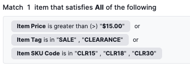
  • Enhanced display of display-only Rule Builders so that they are more human-readable

    • This allows a FieldArrayBlock to be marked as displayOnly and for that to be inherited by its child field components.

    • This also improves the look of displayOnly RuleBuilderFields.

      Display-Only Rule Builder Example
  • Introduced support for Computed Dates in DateField component.

    • Takes in metadata-provided computedFromDate, computedFromDuration, and computedFromDurationUnit attributes to dynamically compute the value of the read-only date field.

  • Introduced a new DateRangeField component to display dates in a range format, e.g., "Start Date - End Date".

  • Introduced new DurationField and DurationColumn components to display duration values given specific base units, e.g., "2 weeks".

  • Added support for displaying a success toast notification message when a new entity is created. This is driven by the successNotificationOnCreate attribute. Additionally, a custom message can be set via the successNotificationMessage attribute, otherwise it will fall back to a default success message.

  • Updated the ActionListGridSelectAction to display a toast notification to indicate when the sort action is in process, and another to notify that the sort action was applied successfully.

  • Updated components to support displaying metadata-driven icons in action buttons:

    • Updated the ActionListGridAdvancedSearch component to display a button with a filter icon instead of the original "Filters" label. This icon can be modified via the filterIconName metadata attribute.

    • Updated the ActionListGridModalFormButton component to support displaying a button with a custom icon instead of the action definition’s label. This is driven by the iconName metadata attribute, and if it is not set, it will fall back to displaying the label as before.

    • Updated the custom Export and Import views to also display icons in their buttons and allow for customization via the iconName metadata attribute. By default, these views will display an upload icon and download icon, respectively.

  • Updated the BetterSearchInput component to display an explicit search button, instead of relying on the user to press enter after typing in their search query. This also allows for better accessibility.

  • Added a new selectableWhenMutableOnly metadata attribute to the ActionListGrid component. This is helpful to disable row selection and thus prevent the use of actions on entities that are not mutable.

  • Added a new forceCatalogSelector metadata attribute to Entity Forms that forces displaying the Catalog Selector, overriding the default behavior where it is only shown in Create forms.

  • The Rule Builder is now able to render lookups that are dependent upon the values from the parent form. To achieve this, the $parent prop is now being passed to the RuleBuilderQueryBuilder component.

  • The Grid Create Action now supports refetching on action success based on the new readOnSuccess metadata attribute.

  • Introduced components to support the new Interdependent Grid Concept

  • Implemented custom behaviors in the FieldArrayGrid component to support custom messages for Boolean Attribute Choices, defaulting the choice labels to "Yes" and "No".

  • Updated the main navigation to display the Application Logo instead of the Application Portrait and added environment properties to provide better control over this selection:

    • VITE_USE_PORTRAIT_ASSET_IN_MAIN_NAV: reverts to using the Application Portrait in the main navigation when set to true. This property is false by default.

    • VITE_USE_PORTRAIT_ASSET_IN_APPLICATION_SELECTOR: allows using the first letter of the Application Name instead of the portrait asset as the portrait in the application selector when set to false. This property is true by default.

  • Allowed metadata for entity forms to define a isCatalogOverrideFallbackHintField attribute that can be used as a fallback to determine if the current entity is a catalog override in the current context, even if its ContextState data does not indicate that it is an override.

    • The exemplifying use-case here is a Product from parentCatalog which has characteristics defined in childCatalog. If viewing the entity from the childCatalog context, Product.contextState may not have field changes and will not seem like an override, but the new characteristicsOverriddenHint field in CatalogServices will be used as a fallback to ensure the 'undo overrides' button still appears.

  • isProductionCatalogEntity is now exported as a public method out of CatalogUtils to allow its direct invocation in Delete.tsx

Bug Fixes

  • Fixed extra translations being submitted on entity forms where the values were the same as the default, untranslated values.

    • When in translation mode, an extra call will now be made to fetch the entity’s data without the language header in order to maintain in state the untranslated values for comparison when the TranslateModeService builds out the list of translations to submit to the backend APIs.

  • Added support for metadata attribute default_selected_component_id in TargetKeyLookup component.

    • When it is set, that value will be used to find a matching component and use it as a default selection if no component is found, the first component will be used.

  • Fixed typo on showInAdmin for badge columns/tile components (attribute name changed on the metadata)

  • Fixed TimeZoneProvider not making requests with appropriate scope and against the right endpoints.

    • Previously, this would not work for users without ALL_ADMIN_USER permissions.

  • Application selector will be hidden when no applications are available

  • Fixed mistakenly including the sandboxId in external grid requests when the grid isn’t sandboxable

  • Fixed an issue where the list grid rows are not selectable when they are displayed in a modal popup

  • Fixed an issue with validation for fields with multiple conditions

  • Fixed a bug where the 'Undo Overrides' action was being offered to users even when the entity was not specifically overridden in the current catalog context. This enabled the possibility of users making requests to undo overrides inherited from parent catalogs. Going forward, the action will only appear if the current catalog matches the entity’s override catalog.

  • Added handling in the FieldArrayGrid component to prevent modification of attribute choices that are derived from enum characteristics.

  • Fixed a bug where the 'Undo Overrides' action was being offered to users even when the entity was not specifically overridden in the current catalog context. This enabled the possibility of users making requests to undo overrides inherited from parent catalogs. Going forward, the action will only appear if the current catalog matches the entity’s override catalog.

  • Fixed a bug in LookupColumn where it failed to detect that the lookup value should be hydrated and instead displayed the entity id.

  • Added support for handling strings with single quotes in SpEL expressions, which were previously stripped or would result in errors at evaluation.

  • Replaced polling in the useSummaryGrid in favor of a refresh button.

    • This fixes an issue where continuous polling would clear the state and cause selected rows in the change summary grids to become unselected.